


Design for Children
Design for children is about problem-solving and about improving the quality of life. It should go beyond questions of durability, ergonomics, safety and function, to also carefully think about materials, textures, aesthetic and sensory qualities.
Design should consider how children respond to all environmental stimuli (visual, touch, smell, etc.). These stimuli inform and enrich children’s experiences and affect interactions within their environment and with other people.
After all, children are immersed and engaged and connected with their environments far more than adults. They deserve sensorially complex spaces, which inspire many possibilities, enquiries, and adventures!
The attention we pay to designing and decorating an interior and how we resource it has a significant impact on the way children interact with their environment and each other. It also reflects our own image of children and our own expectations of their potential. The way we design a space communicates this expectation and value.
Browse our new HABA Pro brochure – colours and function combined!
Putting the right colours in the right place.
Or… we could talk about the targeted use of colour: applied thoughtfully and harmoniously. With HABA furniture, we can use natural materials! Natural wood has its own depth of colour and complexity due to being natural and growing in the real world. We can also choose to apply colour in the finishes we use. Water-based, non-toxic colour washes, seal and protect the wood and also allow the natural wood grain to show through, complete with its glorious ‘imperfections’. We can also upholster furniture using natural or (as well as carefully sourced and sustainably made) synthetic or recycled materials.
Sources of colour can also introduce secondary qualities and complexities. Such as when sunlight passes through a coloured acrylic and creates a backlight and a colour shadow on the floor or wall, changing with sunlight throughout the day. All of these small complexities add to the whole, creating a more engaging space where theories about the world are formulated and tested by children.
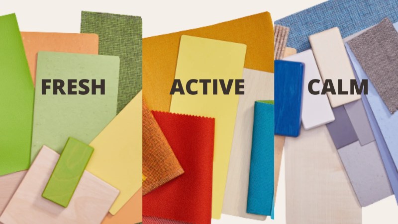
What colours are suitable for a children’s space?
The choice of which colour to introduce concerns relationships between colours, how they work together and complement each other, as well as the activity that will take place in the room. Is it active play or a quieter and more reflective space? Do the colours of the things we put into the area (for example, the furniture) relate meaningfully to the visible interiors (walls, flooring, finishes)?
The question is not only about which colours but about the intensity and the tone of these colours. Care should be taken with highly saturated or primary colours. These can overstimulate the senses and, unless carefully integrated into the whole, can distract and overwhelm the room. Instead, mainly secondary and tertiary colours can be used, with medium tones, well-balanced and tranquil, with well-thought-out complements and contrasts that ‘make sense’ and create harmony. For this reason, interiors and furnishings can be planned together, ideally at the same time.


I’ve visited some truly beautiful nurseries: among the best in the world, made by architects and designers entirely in dialogue with children, their educators, and pedagogical research. Visually, these have been hugely diverse, including white spaces with grey floors, where accent colours come only from the furnishings; rooms with kaleidoscopic colours and materials blended into the fabric of the room to make a coherent and balanced whole; or rooms with different pastel colours on each wall, complementing and enhancing each other, providing complex colour relationships, so that the experience of facing in one direction (perceiving specific colours) is subtly different from facing in another direction … with the furniture colours and materials also an integral part of the interior design.
(the last example might be the Loris Malaguzzi International Centre (CILM) and school at Reggio Emilia or many projects by the architects of ZPZ Partners in Modena).
Environments for Children
With HABA, the Grow. upp range is one outcome of a research project on children’s spaces, and it creates a design language that, both in colour and forms, is based on nature. Shades of soft green, brown and blue tones promote positive associations with the natural world. The familiar but abstract shapes, the real wood materials, and these harmonious combinations of colour are designed to create a feeling of safety and security and propose different possibilities and pathways: supported by modularity that allows the space to be reconfigured and reimagined for other activities. Grow.upp is a space for exploration, interactions and experiment.
A different scheme and combination might be appropriate to create a calm space for a sleeping room or a Snoezelen sensory room or more dynamic colours in an area for movement. The colour scheme and choices relate to the users, their ages, the room’s function, and their length of time.
Finally,
Our intention when making a children’s space is also to make one that is in some way ‘unfinished’ because it will be finished by the children themselves, by their activities and the things they create, by plants and materials that are brought in to decorate, all of which add further layers and stimuli to the experience of inhabiting the room.
Over-designing and over finishing the space can reduce the sense of possibilities and make the experience literal, linear and constrained rather than open-ended. Above all, let’s try to create beautiful spaces filled with possibilities because children have a right to beauty.

For more information and an introduction to the targeted use of colour, please refer to our HABA furniture catalogue p. 218 and the Grow.upp brochure, which introduces the research project that underpins the room concept approach. The HABA range enables multiple opportunities to configure each product, choosing from various colours and material finishes suitable for your space.
Using Colours
Colours influence our perception and our moods, emotions and well-being. That’s why it’s important to consider the effects of colours when designing interior spaces, and to use them consciously in the design process. We have done three colour design concepts for educational facilities: Terra, Aqua, and Dune.


If you are working on a new build, planning a refurbishment, or just looking to freshen up your existing space with something new – we offer a room planning service with advice how effectively use colours.


